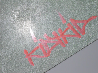
Today I started my two week project in print. The brief is about space and how we personalise it, alter it connect with it and how space defines us. At first I thought about space in regards to personal concepts. Like your bedroom is your personal space and the things you put in that space defines who you are. When I went into the studio however I changed my mind completely. The walls in the studio were covered in paint splatters and so was my desk. This got me thinking about how other people change space and other things can change space also. Here are some photographs I took around the college of how people can change space.
These are photographs I took in my studio. You could say these were the starting point to my concept.
These are photographs I took around the college today. The photos show that people change spaces in many different ways like graffiti, stickers, using paper or just writing on the wall. I particularly like the picture I took of the writing on the bathroom door "GET A FUCKIN SKETCHPAD YOU SAD BITCH!". Maybe that could be the title of my project?
Monday, 30 January 2012
Monday, 23 January 2012
Inspirations
Structure and form is very important to designers. These designers are the most relevant to my work:
Gareth Pugh S/S '12. I like the linear structures Pugh creates in his designs.
Viktor and Rolf. I love the work by Viktor and Rolf. The strong structures transform the sihouette and create new shapes.
Commes Des Garcons, a Japanese design house. Like Viktor and Rolf, Commes Des Garcons transform the silhouette of the body using shape and form. I like how the strong design features are mixed with the use the white colour palette.
Paper Manipulation
I chose two shapes from my drawings and played around with these on the stand. Here's a couple of my favourites.
Fashion Elective: Week 1
The only way to describe this week is hectic! The busiest week since I started at college. Our project is about Structure and form. No sewing I'm afraid. My theme is Modern Architecture especially Sydney Opera House.
I did a couple of drawings from some photographs I took in Sydney three years ago and pulled shapes from the drawings. Next stop manipulating the shapes cut out in brown paper on the stands :).
I did a couple of drawings from some photographs I took in Sydney three years ago and pulled shapes from the drawings. Next stop manipulating the shapes cut out in brown paper on the stands :).
Sunday, 8 January 2012
Knitted Black Bag.
Shibori
Shibori is a Japanese fabric manipulation technique. The process is simple. You tie an object into the fabric and boil it. Then take the object out and the fabric should retain the shape.
Receipt collage
Like Joseph Cornell uses things from the past I decided to use receipts in my project and collage them.
Receipts show where people have been at a certain moment in time, I dyed the reciepts in tea to make them look old and antique like.
To take this collage even further in my project I transfered it to fabric using image maker.
Receipts show where people have been at a certain moment in time, I dyed the reciepts in tea to make them look old and antique like.
To take this collage even further in my project I transfered it to fabric using image maker.
Subscribe to:
Posts (Atom)


